
(Darn, I wanted 1979... I waited too long. lol)
What number are you?




 (We intentionally kept it quiet.)
It's just us, the boys, and our immediate family members. So, say a little prayer for us.
However...
In one year - Saturday, August 8th, 2009 - we will renew our vows in the church and invite a larger group of friends and family to join us for the ceremony. So, mark that down in your calendars and make sure I have your updated mailing address.
I put Jessi in charge of the camera. She has pictures posted here.
I wish we could have everyone with us - but, that's what next year's ceremony is for.
We love you all,
~Sara & Matt Bequette~
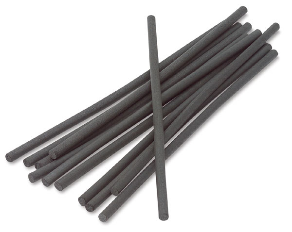
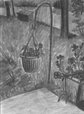
"Hey Sara!I understand your frustration with charcoal. Try getting a few different kinds of charcoal. You'll find that they all do something different. When combined they produce the results you are looking for. The biggest thing is to just practice with it. And make sure you practice with the kneading eraser too. It's such a great tool.You have a good start. Just get some compressed charcoal to add your shadows and then use the eraser to add your highlights." - Candice Bruegeman
"Candice, I completely missed the part in the assignment that said we could used the compressed charcoal sticks! I thought that we were to only use the vine charcoal. Thank you for your suggestions, I truly appreciate them and will definitely take them into consideration for future assignments. I may have time tomorrow to rework my drawing some. I am unused to the broad strokes that the charcoal delivers. I kept trying to sharpen the edges to a point, but that doesn't last very long. I would create dark edges, blow the excess powder away and the dark color would disappear with it.Thank you again," ~Sara~
"Sara, it is a good start. You definitely have good control. I find a piece of medium or fine sand paper is handy to get a finer edge with any lead or charcoal medium. Erasing the dark space helps to. Practice Practice." - Jacob Seright

Here is what was said about this version:
"Sara, I am looking at both of your submissions-though the first one has a lot of dark tones and definitely needed contrasting lights, it also had more interesting marks in the grass. Right now the grass needs a few dark marks to break up the greyness.The bigger areas line the light grey geometric area closest us still needs a variety in value (it should contain more than one tone) Also the grass behind the trees should get darker-to indicate that that space is further away from the viewer." - Prof. Yevgeniya Baras
"This is really good, You seem to have your perspective down and the water looks realistic to me. I like your Mom's little planter, it is cute, especially in front of the background. Great job!" - Erin Norton


 Posts
All Comments
Posts
All Comments


